The Quiet Impact of One Continuous Tile
Disclaimer: As an Associate I earn from qualifying purchases at no extra cost to you. See more here.
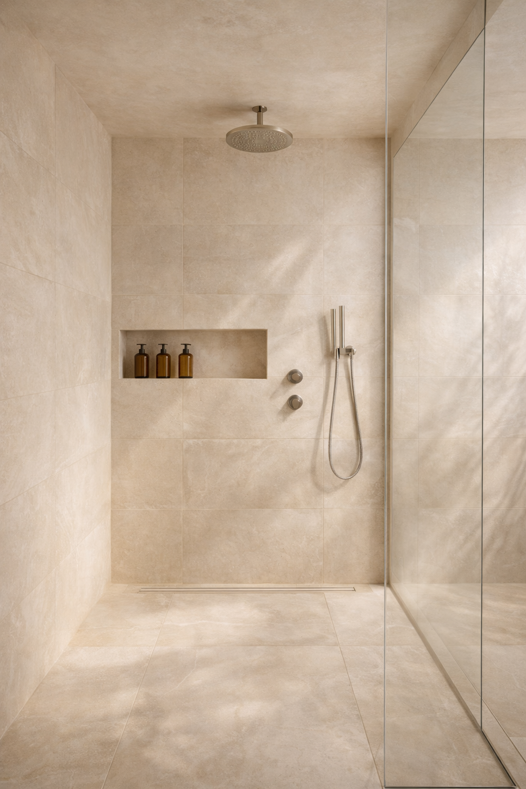
This shower works because it is made of one decision.
The floor, the walls, and the ceiling are wrapped in the same warm stone-look tile. There is no change in color at the base. No decorative strip cutting across the wall. No different tile on the floor to “define” the space.
Because the material does not change, your eye does not stop.
Instead of noticing parts, you register the enclosure as one surface. That is what makes it feel elevated.
Most bathrooms are built in sections. Different floor tile. Accent band. Mosaic niche. Trim pieces outlining edges. Each change asks your eye to adjust. Even when the materials are individually beautiful, the room can start to feel pieced together.
Here, the consistency removes that feeling.
What You’re Actually Looking At
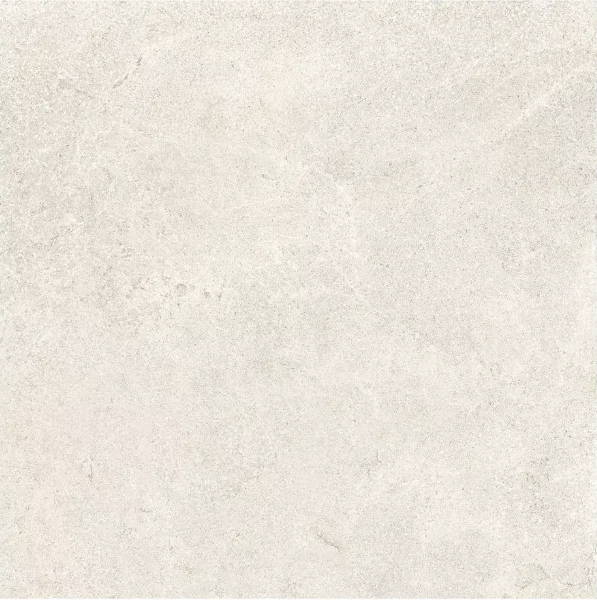
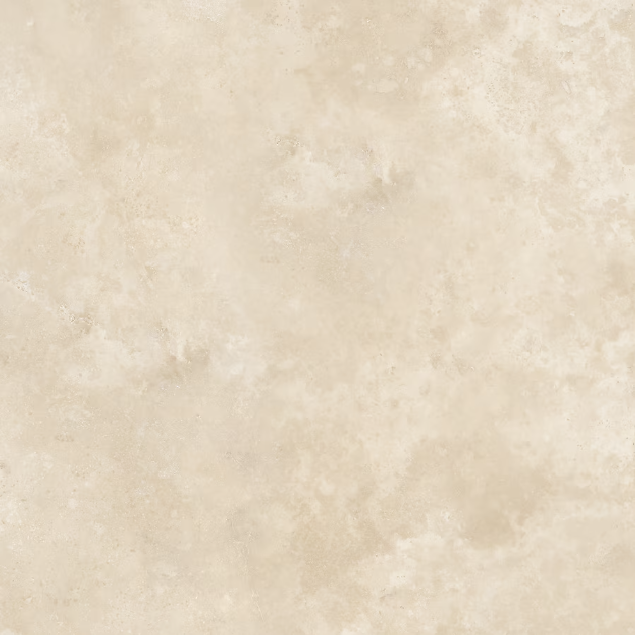
The tile reads like limestone, but it is most likely porcelain designed to mimic limestone or travertine. The important details are not the brand name. They are the qualities.
The tiles are large. Likely 24 by 24 inches or larger. Large tiles reduce the number of grout lines. Fewer grout lines mean fewer visual breaks across the surface.
The finish is matte or lightly honed. There is no shine bouncing light around the room. Gloss would introduce glare and reflection. Matte absorbs light softly, which keeps the enclosure feeling calm.
The color is a warm beige with subtle variation. Not gray. Not creamy yellow. There is clouding in the surface, but no dramatic veins. Strong veining would turn the tile into a pattern. This tile stays quiet.
The grout is very close in tone to the tile. When grout contrasts heavily, you start to see a grid. When it blends, you read surface first, lines second.
If you want to recreate this, you are not looking for “the exact tile.” You are looking for:
• A warm limestone-look porcelain
• Large format sizing
• Matte finish
• Grout that disappears into the tile
Those characteristics matter more than the brand.
The Home Depot | Italian Metalia Porcelain 24 in. x 24 in. x 9mm Flooring and Wall Tile - Ivory (4 PCS, 16 sq. ft.)
Lowe’s | Satori Ivory 24-in x 24-in Honed and filled Natural Travertine Floor and Wall Tile ( 8-sq ft Carton )
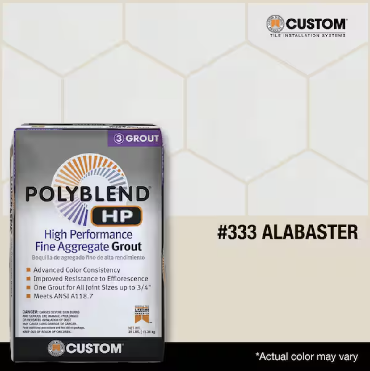
The Home Depot | Polyblend HP #333 Alabaster 25 lbs. High Performance Fine Aggregate Grout
Why This Feels More Architectural Than Decorative
There is no focal point in this shower. That is intentional.
Many bathrooms rely on a “moment.” A patterned inset. A bold floor. A high-contrast niche. These features pull attention. They create a highlight.
This shower avoids that strategy. The interest comes from proportion and scale instead of contrast.
When the same material runs from floor to ceiling, the walls feel taller. Your eye moves upward because nothing visually blocks it. That vertical continuity subtly changes how spacious the room feels.
Large tile also changes perception. Smaller tiles create more lines. More lines create more information to process. Large tiles simplify what you see.
The niche follows the same logic. It is lined in the same tile as the wall. There is no border or contrasting background. Because it does not introduce a new material, it feels built into the structure rather than applied afterward.
The hardware stays simple for the same reason. Brushed metal. Clean shapes. No mix of finishes. It does its job without competing with the surface.
If you were to swap in black fixtures, a mosaic niche, and a contrasting floor tile, the entire mood would shift. Not because those choices are wrong, but because the room would begin dividing into sections instead of reading as one volume.
How to Apply This Thinking in Your Own Space
You do not need this exact bathroom to use the concept.
The principle is material continuity.
Material continuity means allowing one surface to repeat without change. When a material continues vertically or wraps across planes, it feels structural. When it changes frequently, it feels layered.
If you are designing a shower, that could mean:
Choosing one tile and carrying it across floor and walls.
Selecting grout that blends instead of contrasts.
Avoiding decorative inserts unless they truly add meaning.
The same thinking works outside the bathroom.
A backsplash that runs to the ceiling instead of stopping halfway up the wall.
Paneling that continues beyond a focal wall.
Stone that wraps around a fireplace instead of switching at the corners.
The goal is not minimalism for its own sake. The goal is reducing unnecessary shifts in material.
Budget and Reality
This look does not require luxury pricing. It requires restraint.
At a higher price point, this could be real limestone or travertine, a concealed drain, and custom stone fabrication for the niche.
At a mid-range level, it is often porcelain in a large format with a linear drain and a tiled niche box.
At a lower budget, it might be 12 by 24 inch warm beige porcelain with a standard center drain and a prefabricated niche insert.
The feeling comes from repeating the material, not from the label on the box.
Important Details People Overlook
Lighting temperature changes how warm beige reads. Under cool bulbs, it can look gray. Under very warm bulbs, it can skew yellow. Testing a tile sample under your actual lighting matters more than most people expect.
Slip resistance matters on shower floors. Matte finishes tend to provide more grip than polished surfaces, but checking the slip rating is essential.
Large-format tile requires careful installation. Slight unevenness is more visible when each tile covers a large area. The visual simplicity demands technical precision.
These are not dramatic details, but they shape how the finished space feels and performs.
Where This Works Best
This type of enclosure pairs well with warm wood vanities, soft white cabinetry, and brushed metal finishes. The warmth of the tile connects easily with oak and walnut.
It becomes harder to maintain this effect if the surrounding bathroom introduces strong cool gray cabinetry, heavy black contrast, or multiple competing finishes. The continuity inside the shower needs reinforcement outside of it.
The Larger Lesson
This shower is not impressive because it is bold.
It is impressive because it commits to one idea and follows through.
One tile. One tone. One finish family.
When materials repeat and visual shifts are limited, the room feels more cohesive and less assembled. You are not drawn to individual features. You experience the enclosure as a whole.
In a bathroom, that kind of visual quiet often feels more luxurious than contrast or ornament ever could.